SRB2 World Demo

[Re-Usable] SRB2 World Demo Demo 1

Sonicjrfan

Sonicjrfan

Well-known member
You have softlocks on the levels. Also low sky ceiling. Since you are a beginner, you should check out the Zone Builder tutorials.
 
eeh.. its not terribly bad, and its fuctional at least, but, theres a lot to fix and do, honestly.
All your maps have a severe lack of decoration, that need to be fixed ASAP, thought, its not the worst thing, at least you tried, good job! Keep learning and improving!

MAP01:
-Its way too empty, if its supposed to be a grassland, like a meadow or hills, you maybe add more decoration, like some lakes here and there, some waterfalls, maybe a hollow mountain on the middle of the map, to add a some cave systems.
1711331650379

Try making it less spacious and empty, if this is a coop map.


-Try to separate the platforms from the floor and walls, they blend with the walls that mark the map boundaries. Give it different textures that might look good estetically on the map, do trial and error using different textures, and see whichever fits the best.
1711331588999

This looks weird, having the same texture


-If youre gonna put emeralds in the middle of the map, as some sort of Emerald Quest Wannabe, at least put them in small platforms with the color of said emerald, like green for the first emerald and etc.
1711331812767

It looks weird being them sitting at the floor like a regular ring.


-PLEASE.. dont do this, dont put enemies near the player when they start the map, it is not funny being spawn camped by a random enemy, in case you were a bit busy or whatever, this is just annoying.
1711331896317

try moving them away, theres 2 Buzz that start to chase you upon map load.


-Is this wall meant to be black? because you might had a broken sidedef, or open sector.
1711331993539


-I think you forgot to add a spring here, have you?
1711332049094


MAP02:
-Then again, same issue as before, too spacious and empty.
1711332212874

Try compensating with some decoration here and there, maybe a lake, some rocks, or even some cliffs.


-Same mistake with the emeralds, put them in a stand or something, so you know where they are, and it looks better, and if needed move them away so the player needs to look for them, instead of having them spread around like rings.
1711332318188

Put them on a stand or something to highlight them, theyre power stones afterall, give them some respect.


-This is why you need to decorate, i did not saw the cactus until i fell on it. Make it higher or something
1711332443087
Make hazards more visible, this way looks weird.


-Try toying around with all the tech related textures, this just look straight up weird, or if so, try adding a translucent FOF with cloud texture, for a wind effect, like in Sonic Adventure
1711332564112

This doesnt fit at all for a wind sector.


-At least you were consistent, i appreciate that. Making all sectors that have the same effect look the same.
1711332619946


-If youre gonna add emerald shards, do NOT add a regular signpost, this is too redundant, and looks bad.
1711332749584


Its either one or the other, it cannot be both.

-Same mistake with the rock texture platforms, about textures that dont fit their effect, thought i wont attach any screenshot, i already explained.

MAPA3:
-The whole map is just plain too weird, it looks like a hangout map, and i know its Sonic World from Sonic Jam, but do note that these kind of maps dont work with a cooperative style. These maps only fit more as a hangout map. It has the same first issue as the other 2, too empty and spacious with too little to see.

MAPA6:
-Its literally the same Sonic World map, but in another slot.

MAPA7:
-Please move the player spawn away from the monitors, you spawn being softlock on the monitors, unless you break them
1711333143249

You spawn stuck in the monitors.

MAP04:
-Theres no much to do, and its, yet again, way too open wide and empty, fill it out with stuff to compensate, or make it smaller.


MAPA1:
-Do i need to say it again?.. also, because how empty it is, it looks like a race map, try adding some hazards here and there.


-I think you accidentally had these Sidedef selected when texturing the neighboring walls, and added midtextures in accident.
1711333405127

Midtextures on places where shouldnt be.


-I think you forgot to add textures here, please fix this.
1711333486879


Missing textures.


MAP05:
-You.. eh.. how do i tell you.. You forgot to add the actual map..
1711333654530
 

Attachments

  • 1711331636342.png
    1711331636342.png
    273.3 KB · Views: 21
eeh.. its not terribly bad, and its fuctional at least, but, theres a lot to fix and do, honestly.
All your maps have a severe lack of decoration, that need to be fixed ASAP, thought, its not the worst thing, at least you tried, good job! Keep learning and improving!

MAP01:
-Its way too empty, if its supposed to be a grassland, like a meadow or hills, you maybe add more decoration, like some lakes here and there, some waterfalls, maybe a hollow mountain on the middle of the map, to add a some cave systems.
View attachment 3168
Try making it less spacious and empty, if this is a coop map.


-Try to separate the platforms from the floor and walls, they blend with the walls that mark the map boundaries. Give it different textures that might look good estetically on the map, do trial and error using different textures, and see whichever fits the best.
View attachment 3166
This looks weird, having the same texture


-If youre gonna put emeralds in the middle of the map, as some sort of Emerald Quest Wannabe, at least put them in small platforms with the color of said emerald, like green for the first emerald and etc.
View attachment 3169
It looks weird being them sitting at the floor like a regular ring.


-PLEASE.. dont do this, dont put enemies near the player when they start the map, it is not funny being spawn camped by a random enemy, in case you were a bit busy or whatever, this is just annoying.
View attachment 3170
try moving them away, theres 2 Buzz that start to chase you upon map load.


-Is this wall meant to be black? because you might had a broken sidedef, or open sector.
View attachment 3171


-I think you forgot to add a spring here, have you?
View attachment 3172
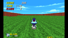

MAP02:
-Then again, same issue as before, too spacious and empty.
View attachment 3173
Try compensating with some decoration here and there, maybe a lake, some rocks, or even some cliffs.


-Same mistake with the emeralds, put them in a stand or something, so you know where they are, and it looks better, and if needed move them away so the player needs to look for them, instead of having them spread around like rings.
View attachment 3174
Put them on a stand or something to highlight them, theyre power stones afterall, give them some respect.


-This is why you need to decorate, i did not saw the cactus until i fell on it. Make it higher or something
View attachment 3175Make hazards more visible, this way looks weird.


-Try toying around with all the tech related textures, this just look straight up weird, or if so, try adding a translucent FOF with cloud texture, for a wind effect, like in Sonic Adventure
View attachment 3176
This doesnt fit at all for a wind sector.


-At least you were consistent, i appreciate that. Making all sectors that have the same effect look the same.
View attachment 3177


-If youre gonna add emerald shards, do NOT add a regular signpost, this is too redundant, and looks bad.
View attachment 3178

Its either one or the other, it cannot be both.

-Same mistake with the rock texture platforms, about textures that dont fit their effect, thought i wont attach any screenshot, i already explained.

MAPA3:
-The whole map is just plain too weird, it looks like a hangout map, and i know its Sonic World from Sonic Jam, but do note that these kind of maps dont work with a cooperative style. These maps only fit more as a hangout map. It has the same first issue as the other 2, too empty and spacious with too little to see.

MAPA6:
-Its literally the same Sonic World map, but in another slot.

MAPA7:
-Please move the player spawn away from the monitors, you spawn being softlock on the monitors, unless you break them
View attachment 3179
You spawn stuck in the monitors.

MAP04:
-Theres no much to do, and its, yet again, way too open wide and empty, fill it out with stuff to compensate, or make it smaller.


MAPA1:
-Do i need to say it again?.. also, because how empty it is, it looks like a race map, try adding some hazards here and there.


-I think you accidentally had these Sidedef selected when texturing the neighboring walls, and added midtextures in accident.
View attachment 3180
Midtextures on places where shouldnt be.


-I think you forgot to add textures here, please fix this.
View attachment 3181

Missing textures.


MAP05:
-You.. eh.. how do i tell you.. You forgot to add the actual map..
View attachment 3182
Now yeah I do think it not all bad but it just some of the levels can lose Interest of playing
 
Top